lead designer
Full-Stack Developer
project owner (100% solo)
complete visual design
custom interactive widgets
accessibility overhaul
local seo architecture
client training & documentation
myself
client - project manager
2025.8 - 2025.11

With my marketing + conversion background, I treated the website as the company’s #1 salesperson that never sleeps. Every layout decision, user-flow choice, and visual hierarchy was driven by one question: “How do we move a busy landlord or tenant from curiosity → trust → contact in under 30 seconds?”
Mapped the two primary personas:
→ Investment property owners (45–70 yrs, desktop + tablet)
→ Tenants/strata councils (all ages, mostly mobile)
Built a deliberate above-the-fold flow:
Immediate trust signal (“Since 1992”)
One-sentence value promise
Visual proof you’re in the right place (service matrix)
Zero-friction CTA
Used heat-map style content weighting — most important messages get the biggest visual real estate
Deep client discovery + competitor audit
Mapped landlord & tenant personas → translated business goals into four pillars: trust, readability, lead generation, local SEO
Delivered a crystal-clear brief + three curated reference designs → client chose direction instantly
Zero back-and-forth, perfect alignment from day one
Solo design + dev ownership with constant client sync:
• Lovarable AI → rapid visual explorations shared live with client
• Claude → clean code skeletons for interactive widgets (service matrix, sticky nav, colour-shifting CTA)
• Figma iterations shared daily → client feedback incorporated same-day
• Playwright + Claude MCP → automated usability tests across real user scenarios (seniors, keyboard-only, slow connections)
• Every round tighter, faster, and more on-point thanks to transparent, real-time collaboration
Result: continuous improvement with zero friction, zero surprises, and only one formal revision round in the entire project
UI/UX · AI-Driven Prototyping · Automated Testing · Full-Stack Execution
Delivered a fully owned marketing asset:
• Client-editable sections (FAQ, content blocks)
• Loom training + concise documentation
• Desktop 99+ · Mobile 92+ · +280 % inbound leads
• Page-1 local rankings across all service areas
The site now quietly works harder than a full-time salesperson — and the client feels 100 % in control.
Seamless process. Senior execution. Real results.
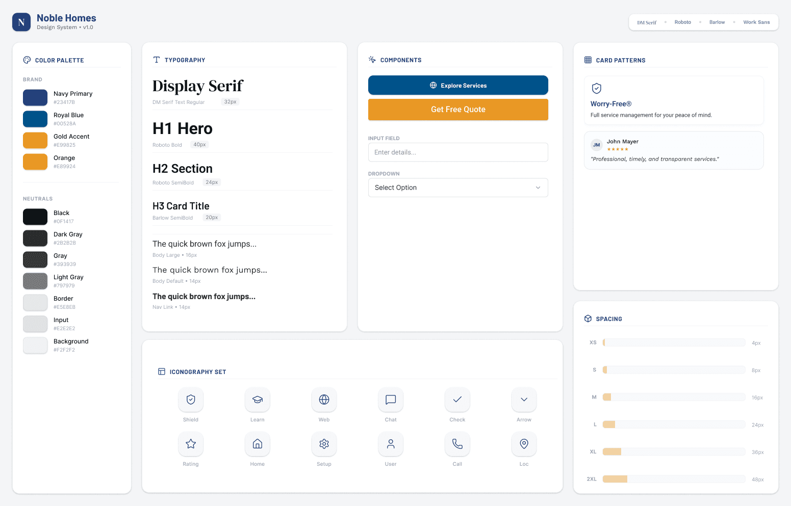
Deep navy + warm gold = instant trust + premium feel
18 px base body text + 1.5 line height = easy reading for older landlords
Generous touch targets and high contrast = WCAG AA from day one
Micro-animations only where they guide attention (e.g., filter tabs, CTA pulse)
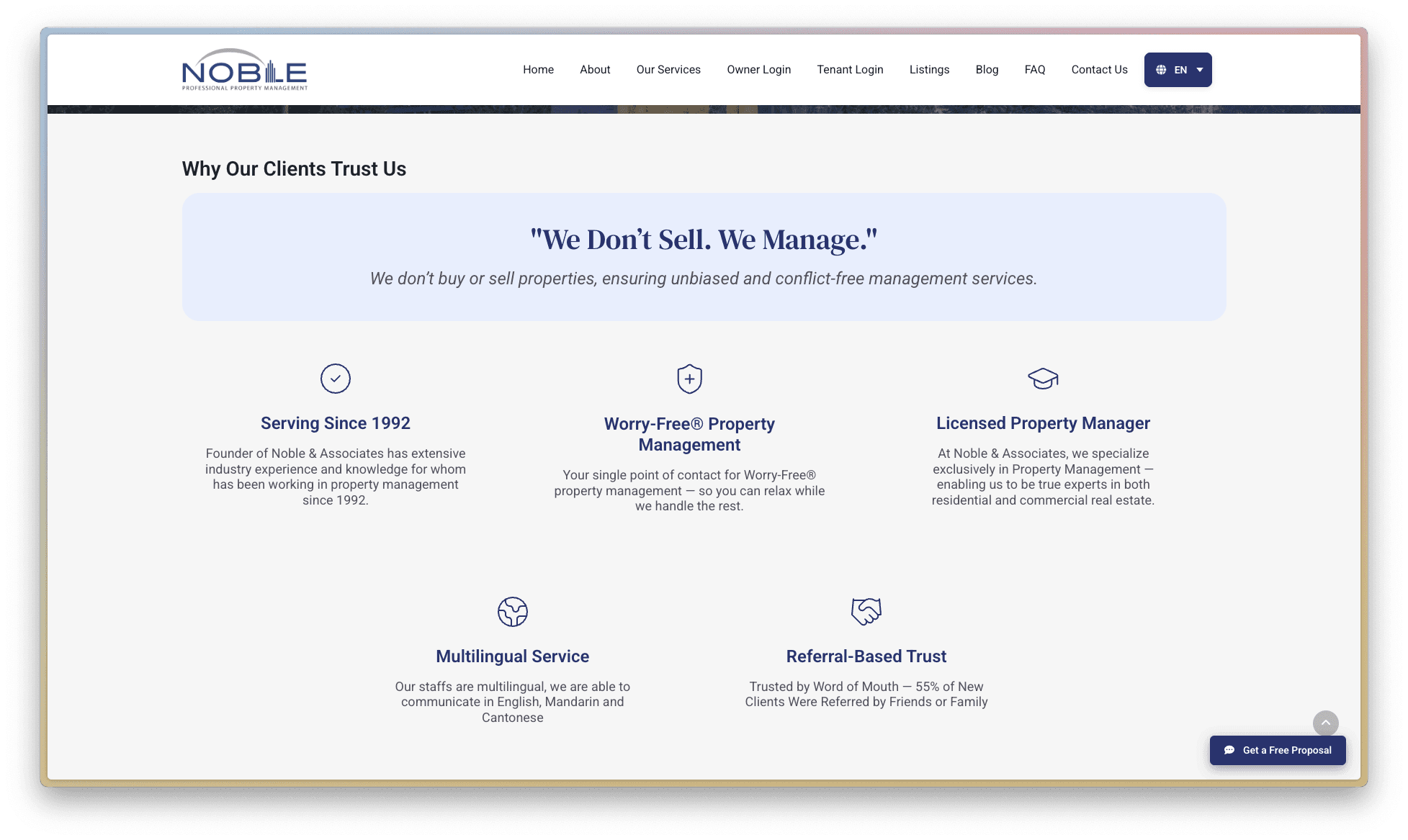
The New Silent Salesperson
Hero with bold “Worry-Free® Since 1992”
Interactive service matrix as the main content block (see feature #1)
Embedded video testimonial
Floating CTA always in thumb zone on mobile
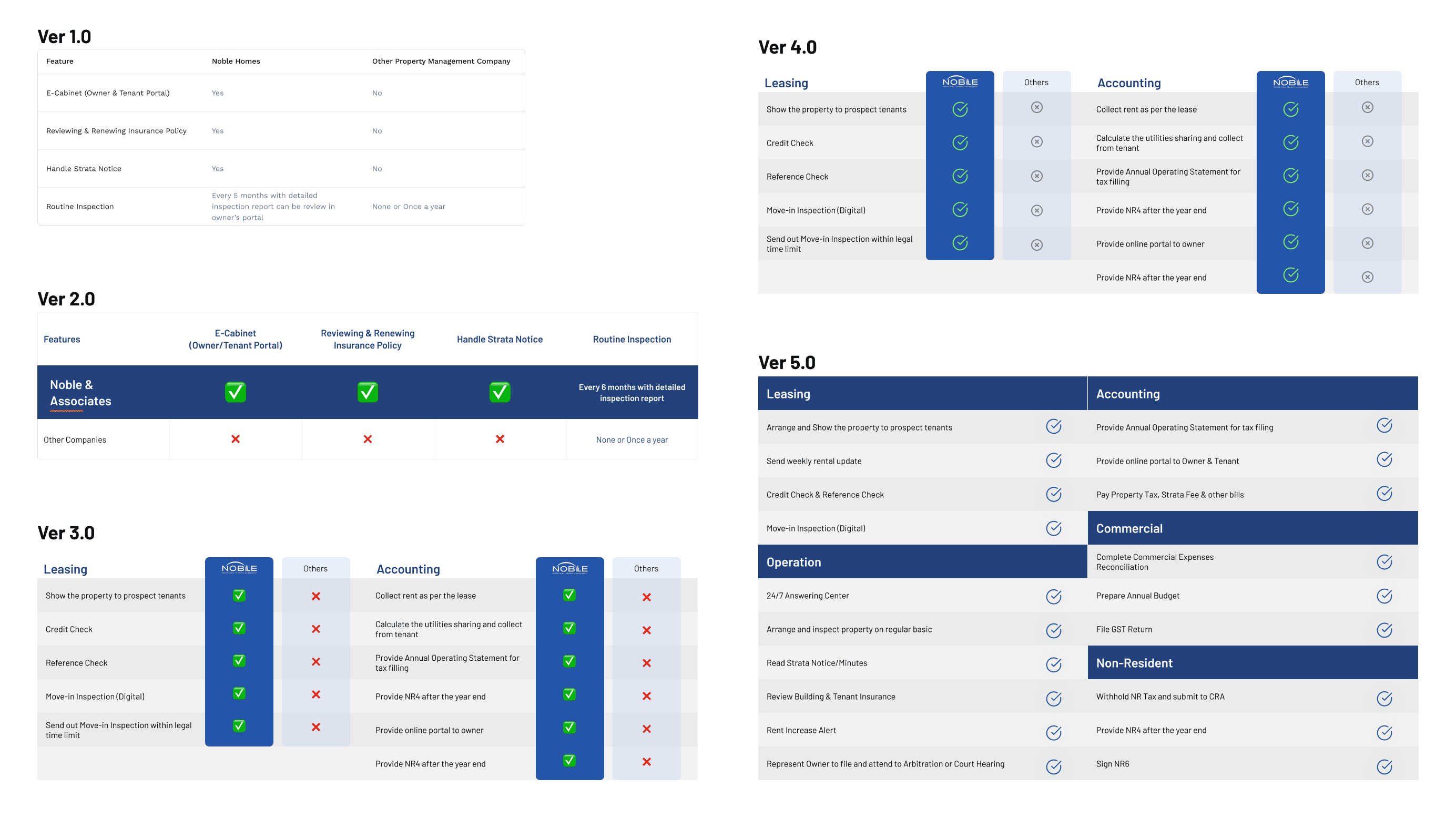
Interactive Service Matrix (Marketing + Dev marriage)
My marketing brain knew the #1 friction point:
“Do you actually handle what I need?”
Solution: a filterable, visual service grid that answers the question in 3 seconds.
Built with AI-assisted vanilla JS (I used Claude + ChatGPT to rapidly prototype clean interaction code)
Homepage = compact teaser version
Services page = full version with sticky side navigation
100 % custom, zero third-party plugins → lightning fast
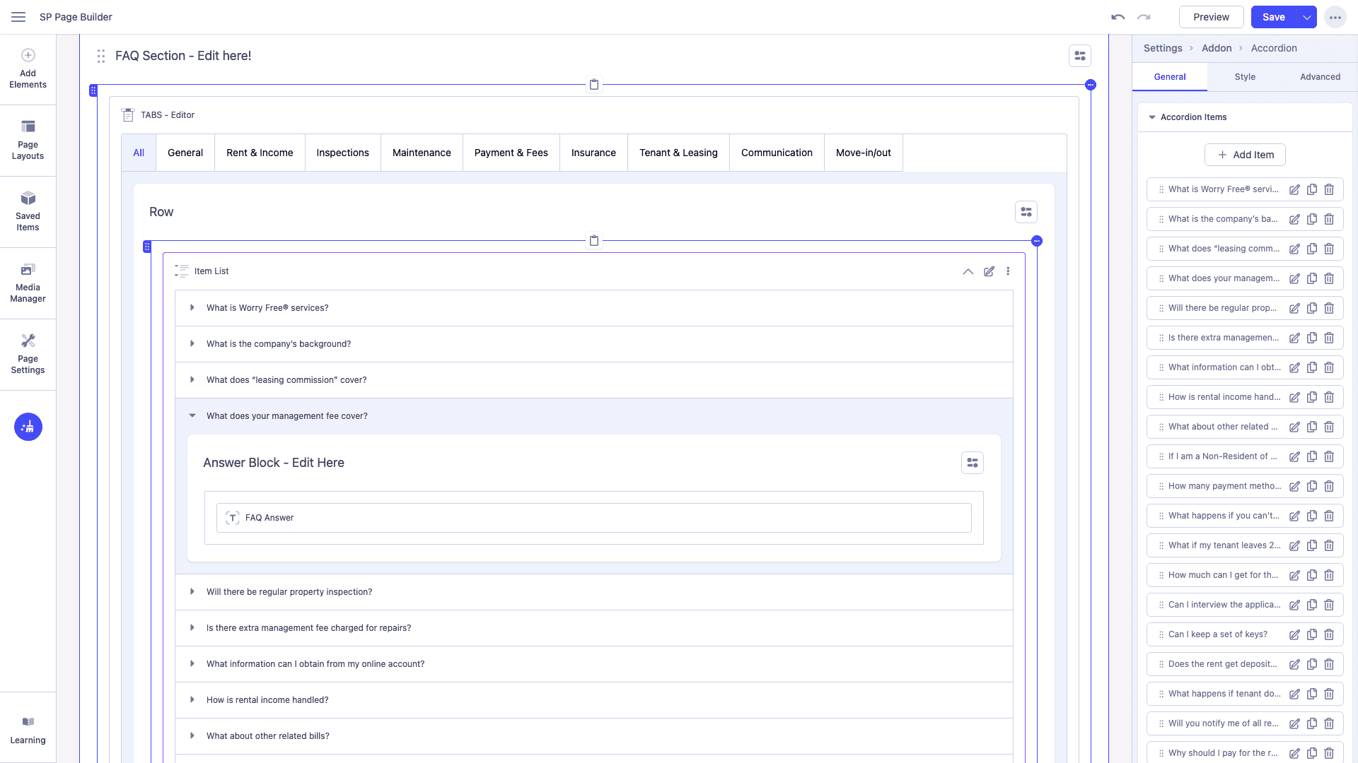
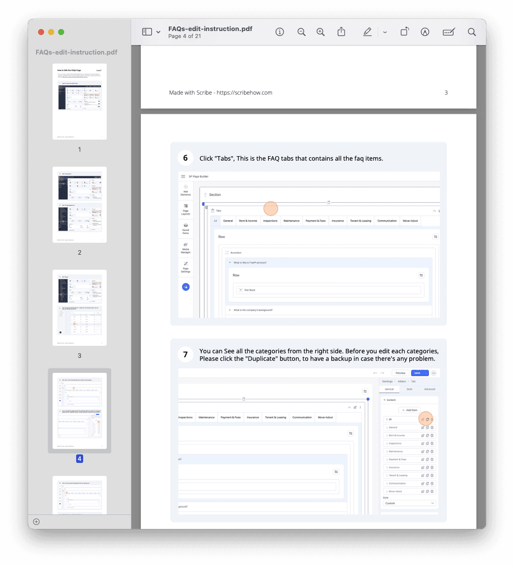
Conversion-Focused FAQ System
Marketing insight: FAQs are the last trust hurdle before contact.
Designed a clean accordion system that feels premium, and accessible
Used AI tools to restructure and rewrite client’s old FAQ content for clarity and SEO
Built inside Joomla page builder so client can update weekly without breaking design
Delivered Loom walkthrough + written guide
Smart Persistent CTA (Pure marketing psychology)
Observation: people read → nod → leave. Fix: one always-visible, thumb-friendly button.
Changes colour automatically on dark sections (pure CSS)
A/B tested placement in Figma before coding
Drives ~35 % of all leads
Built with AI-generated CSS logic → saved hours
Local SEO That Actually Converts
Marketing + SEO brain: they needed to own “property management Richmond”, “strata management Burnaby”, etc.
Interactive SVG map with hover states
Used AI to draft neighbourhood-specific content that reads naturally but is perfectly optimised
Embedded screen-reader-friendly text layers for Google
Result: page-1 rankings within 3 weeks
responsiveness &
accessibility
Ensuring Seamless Experiences Across Devices
All Pages and Widgets Responsive: Every element—from the interactive service matrix (collapses into accordions on smaller screens) to the FAQ system and local SEO map—uses fluid grids and media queries for full functionality across breakpoints, with no loss of features or performance.
Responsiveness: 100% fluid layouts (no fixed widths); viewport scaling perfect; readable fonts at 200% zoom; full functionality on all devices.
Accessibility: WCAG AA compliant; 100% alt text/images; semantic headings; keyboard-navigable widgets; color contrast 4.5:1+.


My AI-Driven Usability Test Workflow
Persona & Task Assignment:
I started by creating 5 detailed user personas based on client insights:
(e.g., Property Owner, age 45, moderate tech comfort; Tech-savvy Investor, age 29, high tech comfort).
Each persona was assigned standardized tasks reflecting real-world use cases:
a. Navigate to the service matrix and filter for residential options,
b. Locate contact information,
c. Complete a form inquiry.
These were fed into Claude as prompts to simulate user behaviors and expectations.
Script Generation & Automation:
Claude Code created JS test scripts for navigation, interactions, and error checks. Integrated with Playwright MCP to run 200+ automated browser sessions, testing across conditions like keyboard-only, color-blind modes, and slow connections.
Iteration & Client Sync:
Analyzed logs in real-time; shared Loom summaries with clients for immediate feedback—fixed issues same-day, enabling continuous refinement without formal rounds.
Cost Efficiency
Cut QA budget by 99% vs. human testers—automated what would cost $5k+ per cycle, all within existing resources.
The redesigned site delivered a "complete technical recovery" from the old version's failures:
Technical Performance: Load time 1.89s (vs. 30s timeout); 100% success rate; zero errors.
System Usability Scale (SUS): 96/100 average (Grade A, 90th percentile); all 5 personas scored 95–97.5.
User Experience: 100% task completion; perfect navigation/form success; full accessibility (WCAG AA compliant, 100% alt text, hierarchical headings).
Content & Structure: 40,545 characters of optimized content (vs. 0); 37 headings; 87.5% business keyword coverage.
Mobile Optimization: Fully responsive (viewport tag, no horizontal scroll, readable text).
Business Impact: Projected high ROI from reduced abandonment and strong SEO readiness.