PeekaBite

PeekaBite

PeekaBite

Redefining Transparency in Packaged Foods

Redefining Transparency in Packaged Foods

Redefining Transparency in Packaged Foods

By Zheng

By Zheng

By Zheng

my role

my role

my role

design lead

product designer

ux researcher

deliverables

deliverables

deliverables

design system

mock-ups

documentation

motion graphics

team

team

team

4 developers

4 designers

time

time

time

2024.9 - 2024.12

13 weeks

project summary

project summary

project summary

In a world where food labels hide more than they reveal, consumers are left guessing about what they’re really eating. Over an intensive 13-week project at Langara College, I teamed up with developers and designers to create a game-changing solution. Enter PeekaBite—an AI-powered food scanner app designed to pull back the curtain on packaged foods. From decoding nutritional facts to exposing hidden health risks and offering tailored recommendations, PeekaBite transforms confusion into clarity, empowering users to take control of their health with every bite.

In a world where food labels hide more than they reveal, consumers are left guessing about what they’re really eating. Over an intensive 13-week project at Langara College, I teamed up with developers and designers to create a game-changing solution. Enter PeekaBite—an AI-powered food scanner app designed to pull back the curtain on packaged foods. From decoding nutritional facts to exposing hidden health risks and offering tailored recommendations, PeekaBite transforms confusion into clarity, empowering users to take control of their health with every bite.

my mission

my mission

my mission

As the lead design in this project, my mission was to create an intuitive, user-centered solution that simplifies the process of making healthier food choices. I focused on ensuring that every decision stayed aligned with our core objective and the actual needs of our users. By translating pain points into actionable features, collaborating closely with developers and designers, and balancing technical feasibility with usability, I aimed to deliver a streamlined, effective, and impactful product.

As the lead design in this project, my mission was to create an intuitive, user-centered solution that simplifies the process of making healthier food choices. I focused on ensuring that every decision stayed aligned with our core objective and the actual needs of our users. By translating pain points into actionable features, collaborating closely with developers and designers, and balancing technical feasibility with usability, I aimed to deliver a streamlined, effective, and impactful product.

As the lead design in this project, my mission was to create an intuitive, user-centered solution that simplifies the process of making healthier food choices. I focused on ensuring that every decision stayed aligned with our core objective and the actual needs of our users. By translating pain points into actionable features, collaborating closely with developers and designers, and balancing technical feasibility with usability, I aimed to deliver a streamlined, effective, and impactful product.

Research Stage: From Health Scoring to Hidden Investigations

Research Stage: From Health Scoring to Hidden Investigations

Research Stage: From Health Scoring to Hidden Investigations

problem definition

problem definition

problem definition

“I check labels all the time, mostly for sugar and sodium content, but it’s hard to figure out what’s really healthy.”

“I check labels all the time, mostly for sugar and sodium content, but it’s hard to figure out what’s really healthy.”

– Participant 3

– Participant 3

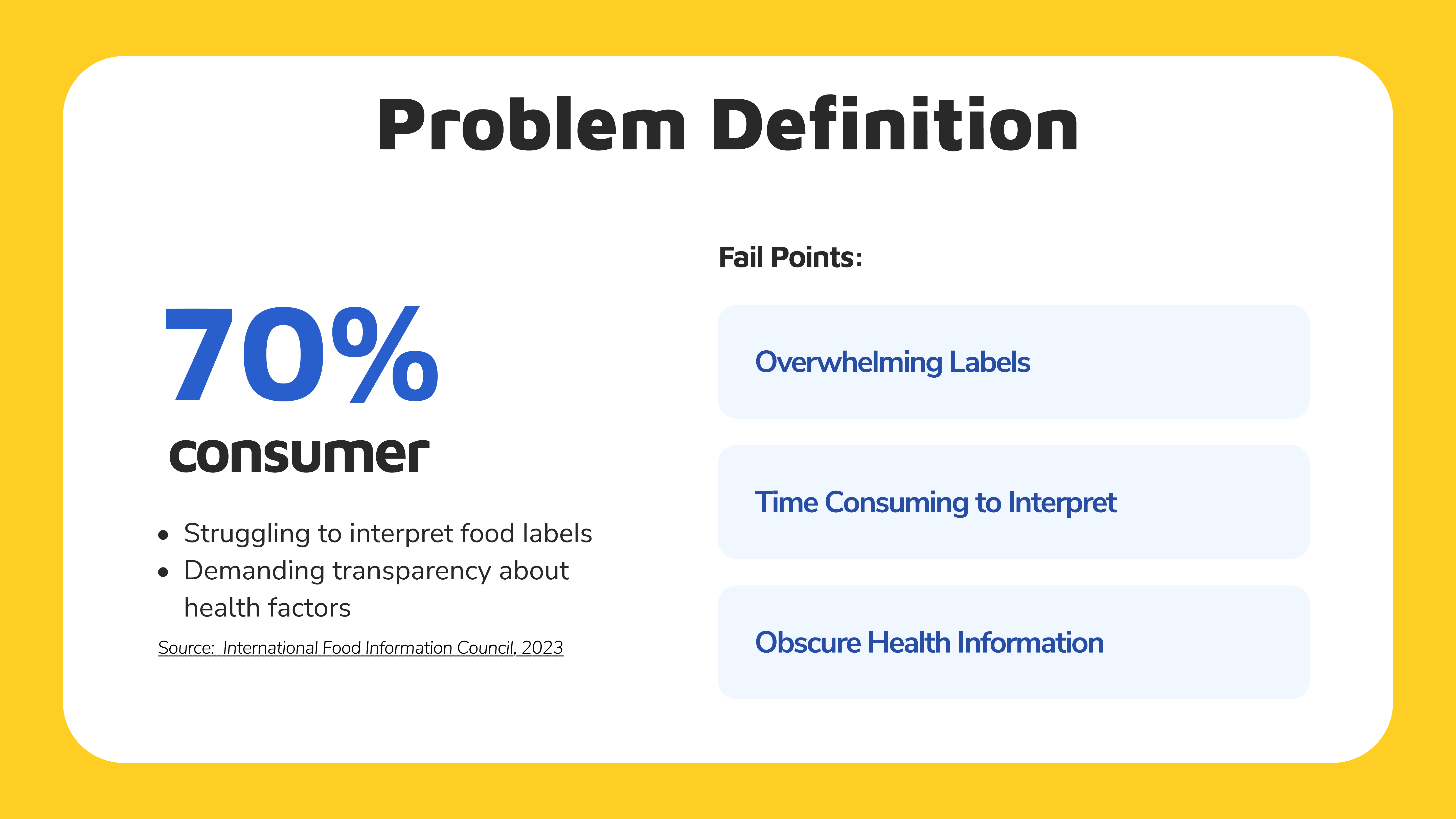
This sentiment reflects a universal struggle: packaged food labels often overwhelm rather than inform. Hidden behind marketing jargon and incomplete details are health risks that consumers fail to uncover. PeekaBite was born to solve this problem—a tool designed to translate labels, expose hidden truths, and make choosing healthier options straightforward and stress-free.

This sentiment reflects a universal struggle: packaged food labels often overwhelm rather than inform. Hidden behind marketing jargon and incomplete details are health risks that consumers fail to uncover. PeekaBite was born to solve this problem—a tool designed to translate labels, expose hidden truths, and make choosing healthier options straightforward and stress-free.

This sentiment reflects a universal struggle: packaged food labels often overwhelm rather than inform. Hidden behind marketing jargon and incomplete details are health risks that consumers fail to uncover. PeekaBite was born to solve this problem—a tool designed to translate labels, expose hidden truths, and make choosing healthier options straightforward and stress-free.

Pain Points:

Pain Points:

Pain Points:

  1. Overwhelming Labels: Labels are filled with complex terms, percentages, and serving sizes that are difficult for the average consumer to interpret. Many users feel lost when trying to assess whether a product aligns with their dietary needs.

  2. Time-consuming to Interpret: Evaluating food labels while shopping requires significant time and effort, especially when comparing multiple products. This process becomes tedious and impractical in a fast-paced environment.

  3. Obscure Health Information: Critical details, such as harmful additives or production risks, are often not clearly disclosed on labels. Consumers unknowingly trust marketing claims, which can mislead them into believing a product is healthier than it actually is.

Problem Definition
Problem Definition
Problem Definition

To address these key problems, we needed to explore potential solutions that could transform the entire process into an easy and straightforward experience for users.

To address these key problems, we needed to explore potential solutions that could transform the entire process into an easy and straightforward experience for users.

To address these key problems, we needed to explore potential solutions that could transform the entire process into an easy and straightforward experience for users.

initial research

initial research

initial research

"Decoding Labels to Simplify Healthier Choices.”

Early research centered on simplifying label interpretation by scoring health metrics and flagging additives. Users desired instant clarity without wading through complex data.

Health Scoring Metrics:

Our first focus was simplifying how users evaluate packaged foods. We researched widely used health metrics, such as calories, sugar, and sodium, and created an AI-driven system to combine these with users’ health conditions. For instance, the AI prioritizes low-sodium metrics for users with hypertension. This personalized health score helps users make smarter choices quickly and effortlessly.

Chemical Additives

Inspired by how the cosmetics industry flags harmful additives, we explored the impact of chemicals in packaged foods. Research revealed that many widely used additives could pose health risks. To address this, we collaborated with developers to integrate APIs providing comprehensive data on additives, allowing the app to warn users about potentially harmful substances. This feature ensures users are informed about hidden risks, making healthier choices easier.

Explore Further: The Oatly Revelation

Explore Further: The Oatly Revelation

Explore Further: The Oatly Revelation

the 'Oatly' story

While researching healthy products, I came across a report about Oatly’s deceptive marketing practices. Despite its branding as a sustainable and healthy alternative, Oatly faced criticism for hidden production concerns and controversial ingredients. This revelation highlighted the need for PeekaBite to dig deeper, beyond the label, to uncover hidden truths.

While researching healthy products, I came across a report about Oatly’s deceptive marketing practices. Despite its branding as a sustainable and healthy alternative, Oatly faced criticism for hidden production concerns and controversial ingredients. This revelation highlighted the need for PeekaBite to dig deeper, beyond the label, to uncover hidden truths.

While researching healthy products, I came across a report about Oatly’s deceptive marketing practices. Despite its branding as a sustainable and healthy alternative, Oatly faced criticism for hidden production concerns and controversial ingredients. This revelation highlighted the need for PeekaBite to dig deeper, beyond the label, to uncover hidden truths.

In case you are interested in how "Oatly" might influence people's health, here's the article:

In case you are interested in how "Oatly" might influence people's health, here's the article:

In case you are interested in how "Oatly" might influence people's health, here's the article:

peeka AI report

Obviously, none of this information can be found on the labels. This realization inspired the development of PeekaBite’s AI Report, transforming the app from a simple label decoder into a detective-like tool that reveals:

  1. Sanitary Hazard: Identifying any sanitary-related issues associated with the product, such as exceeding acceptable levels of E. coli or other potential health risks stemming from poor hygiene standards.

  2. Ingredient Analysis: Highlighting ingredients that are banned in other countries or have documented health concerns, providing users with critical information about potential risks to their well-being.

  3. Production Process: Investigating discrepancies between a product’s marketed claims and its actual production practices. This includes identifying processes that may produce harmful byproducts or involve unintended side effects.

  4. Packaging Hazard: Examining the safety of packaging materials, such as unqualified plastics that could release microplastics or other hazardous substances, potentially compromising the product’s safety.

  5. Brand History: Exploring the brand’s track record for scandals, product recalls, or corporate social responsibility (CSR) issues. This gives users insight into the brand’s reliability and ethical standing.

After exploring various possibilities, we identified three main features to achieve our objectives and address the problems uncovered through user research.

After exploring various possibilities, we identified three main features to achieve our objectives and address the problems uncovered through user research.

After exploring various possibilities, we identified three main features to achieve our objectives and address the problems uncovered through user research.

Solution
Solution
Solution

solution

solution

solution

Turning Confusion into Clarity, One Scan at a Time.

Turning Confusion into Clarity, One Scan at a Time.

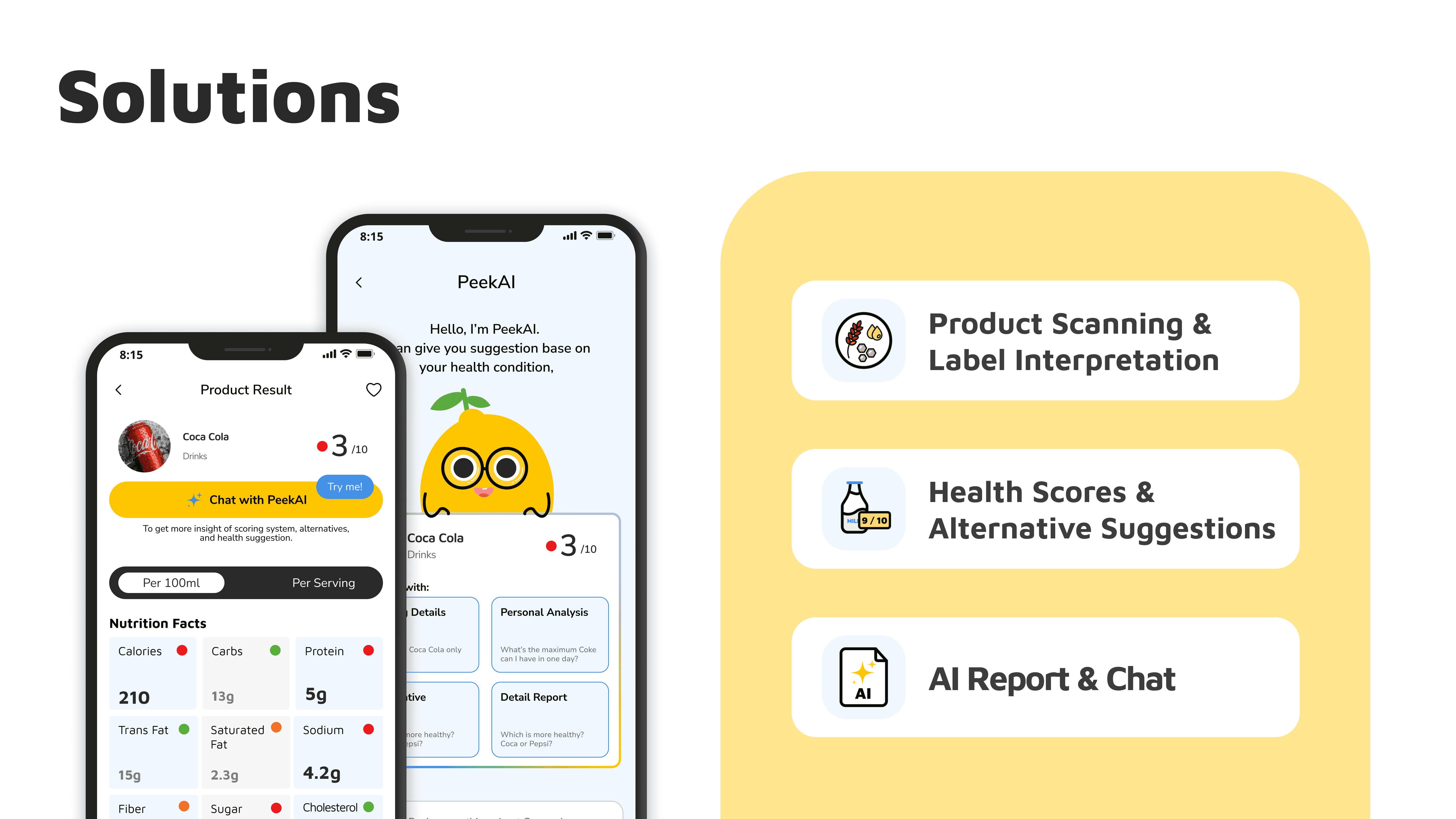
PeekaBite is a mobile application designed to simplify the process of evaluating packaged foods. Users can scan barcodes or labels to instantly access:

  1. Nutritional and Ingredient Information: Clear data on nutritional content, additive warnings, and dietary suitability.

  2. Product Health Score & Alternatives: Personalized health scores based on user input and suggestions for healthier alternatives.

  3. AI Report & Consultant: In-depth insights into production processes, sanitary risks, packaging, and brand history, uncovering hidden concerns beyond the label.

Planning Stage: Simplifying things for user and developer

Planning Stage: Simplifying things for user and developer

Planning Stage: Simplifying things for user and developer

objectives

objectives

objectives

In the planning stage, our focus was on creating a solution that not only simplifies the experience for users but also ensures efficiency for our development team. By strategically defining the app’s main features and prioritizing functionality, we aimed to address core user needs while keeping the implementation process straightforward and manageable.

In the planning stage, our focus was on creating a solution that not only simplifies the experience for users but also ensures efficiency for our development team. By strategically defining the app’s main features and prioritizing functionality, we aimed to address core user needs while keeping the implementation process straightforward and manageable.

In the planning stage, our focus was on creating a solution that not only simplifies the experience for users but also ensures efficiency for our development team. By strategically defining the app’s main features and prioritizing functionality, we aimed to address core user needs while keeping the implementation process straightforward and manageable.

approach

approach

approach

To achieve this, we broke down the complexity into actionable, focused steps:

To achieve this, we broke down the complexity into actionable, focused steps:

To achieve this, we broke down the complexity into actionable, focused steps:

Feature Prioritization: We identified three core features—health scores, additive warnings, and the AI Report—to streamline user interactions and focus development efforts.

Optimized User Flow: Designed a seamless flow to minimize user effort, such as integrating scanning, health scoring, and alternative suggestions into a single, intuitive process.

Scalable Design: Ensured the structure allowed for future feature enhancements without overloading the initial build, keeping it developer-friendly.

Design Stage: Elevating Usability with Visual Appeal

Design Stage: Elevating Usability with Visual Appeal

Design Stage: Elevating Usability with Visual Appeal

objectives

objectives

objectives

In the design stage, the goal was to take PeekaBite one step further—not just functional, but visually appealing and intuitive. We focused on creating a user interface that combines simplicity with an engaging visual experience, ensuring users can navigate the app effortlessly while enjoying a polished design.

In the design stage, the goal was to take PeekaBite one step further—not just functional, but visually appealing and intuitive. We focused on creating a user interface that combines simplicity with an engaging visual experience, ensuring users can navigate the app effortlessly while enjoying a polished design.

In the design stage, the goal was to take PeekaBite one step further—not just functional, but visually appealing and intuitive. We focused on creating a user interface that combines simplicity with an engaging visual experience, ensuring users can navigate the app effortlessly while enjoying a polished design.

approach

approach

approach

Clear Visual Hierarchy: Organized information logically, with health scores, ingredient details, and AI Reports presented in an easy-to-read format, ensuring users find what they need at a glance.

Friendly Aesthetics: Used a clean, modern design with health-focused colors like green and white to evoke trust and freshness, complemented by the cheerful PeekaBite mascot for a relatable touch.

Microinteractions: Added subtle animations for scanning actions, health score updates, and AI Report transitions to create a smooth and interactive experience.

Consistency with UI Kit: Built a cohesive UI kit that standardized fonts, buttons, and layouts, maintaining a seamless design language throughout the app.

outcomes

outcomes

outcomes

By blending functionality with a visually appealing interface, we created an experience that is not only intuitive but also engaging, making PeekaBite enjoyable and easy to use for a wide range of users.

By blending functionality with a visually appealing interface, we created an experience that is not only intuitive but also engaging, making PeekaBite enjoyable and easy to use for a wide range of users.

By blending functionality with a visually appealing interface, we created an experience that is not only intuitive but also engaging, making PeekaBite enjoyable and easy to use for a wide range of users.

Test Stage: Refining Features Through Usability and Collaboration

Test Stage: Refining Features Through Usability and Collaboration

Test Stage: Refining Features Through Usability and Collaboration

objectives

objectives

objectives

The test stage was pivotal in evaluating the usability of PeekaBite’s features and ensuring they met user needs effectively. By examining each feature in detail and collaborating closely with developers, we made critical improvements to enhance the user experience.

The test stage was pivotal in evaluating the usability of PeekaBite’s features and ensuring they met user needs effectively. By examining each feature in detail and collaborating closely with developers, we made critical improvements to enhance the user experience.

The test stage was pivotal in evaluating the usability of PeekaBite’s features and ensuring they met user needs effectively. By examining each feature in detail and collaborating closely with developers, we made critical improvements to enhance the user experience.

usability test

Health Scoring & Additives Warnings: Users appreciated the simplicity of scanning and receiving health scores but found the additive explanations needed clearer visual indicators.

AI Report: While users valued the depth of information, some expressed the need for concise summaries to quickly understand the findings.

Chatroom Feature: Recognizing the chat functionality developed by our team, we elevated it as an add-on bonus for users. To minimize effort, we introduced default questions related to food products, enabling users to start conversations effortlessly. The chat is represented by our cheerful mascot with a gradient-stroke outline, symbolizing the AI’s dynamic capabilities and making the interaction more engaging.

new challenges

During user testing, a key issue emerged: if a scanned product wasn’t in the database (fetched from open food APIs), users were prompted to manually input product details. This raised concerns about potentially incorrect or inconsistent data being added by users.

solution

After discussions with developers about the database structure, we implemented a Report Feature. This feature allows users to flag incorrect or suspicious data, ensuring database quality while empowering the community to maintain reliability.

collaborating with developers

Close collaboration with the development team ensured seamless integration of new features like the chatroom and the report screen. We balanced technical feasibility with user feedback, resulting in a final flow that was both comprehensive and intuitive.

Final Design

Thank you all!

Thank you all!

Thank you all!